At the AGM in Toronto today: Microsoft's existing booth was rebranded for Azure.
With new LED lighting technology built into the wall we were able to play with the colours in the background.
From this...
To this...
At the AGM in Toronto today: Microsoft's existing booth was rebranded for Azure.
With new LED lighting technology built into the wall we were able to play with the colours in the background.
From this...
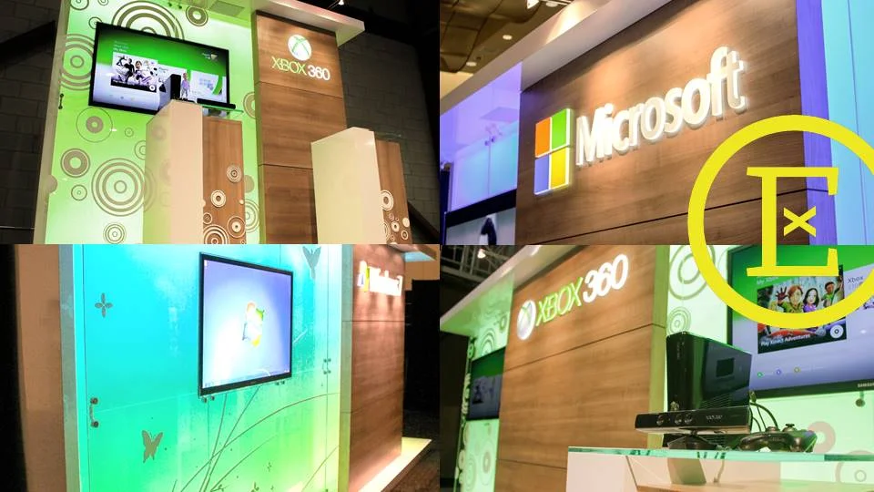
To this...
It has been great to see all the tradeshow and training elements come together for the Connected Homes Summit in Niagara Falls this week. Our designers, carpenters, crews and graphic production staff have been working on new pieces for the Microsoft Canada team and it was great to finally see some live photos from the convention centre today.
Every two years Octanorm Canada hosts a conference for partners who use the German display system. They introduce new extrusions & displays, present improvements they have made, host round table discussions, and also a design competition.
The rental booths (and some purchased ones) that we custom design for our clients are built using this German display system. Unlike your traditional shell schemes provided by show contractors, most of our exhibits incorporate both rental and custom elements. Unique laminates, custom millwork and customized lighting solutions, give our rental booths a look and feel that sets our clients apart from other exhibitors.
Here are some of the designs we submitted for 2013.
We won for the 'Exhibits under 400 sq. ft.' & 'Exhibit over 1000 sq. ft.' :
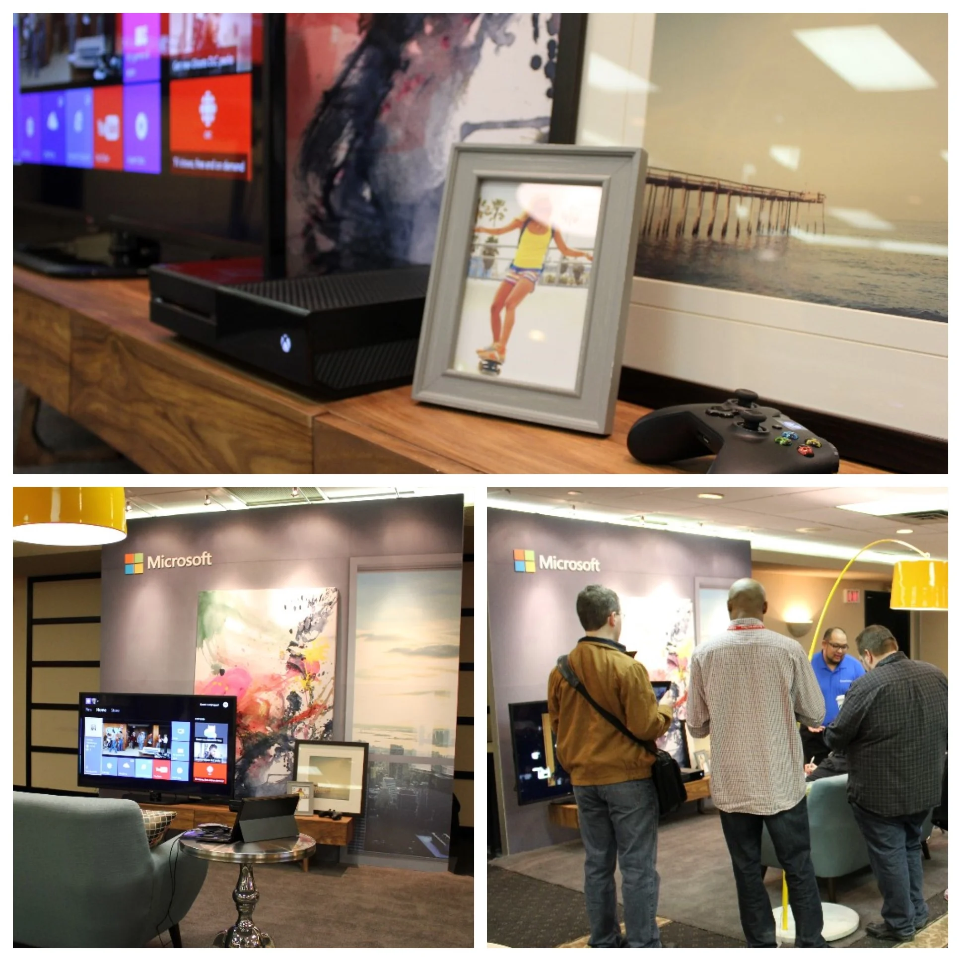
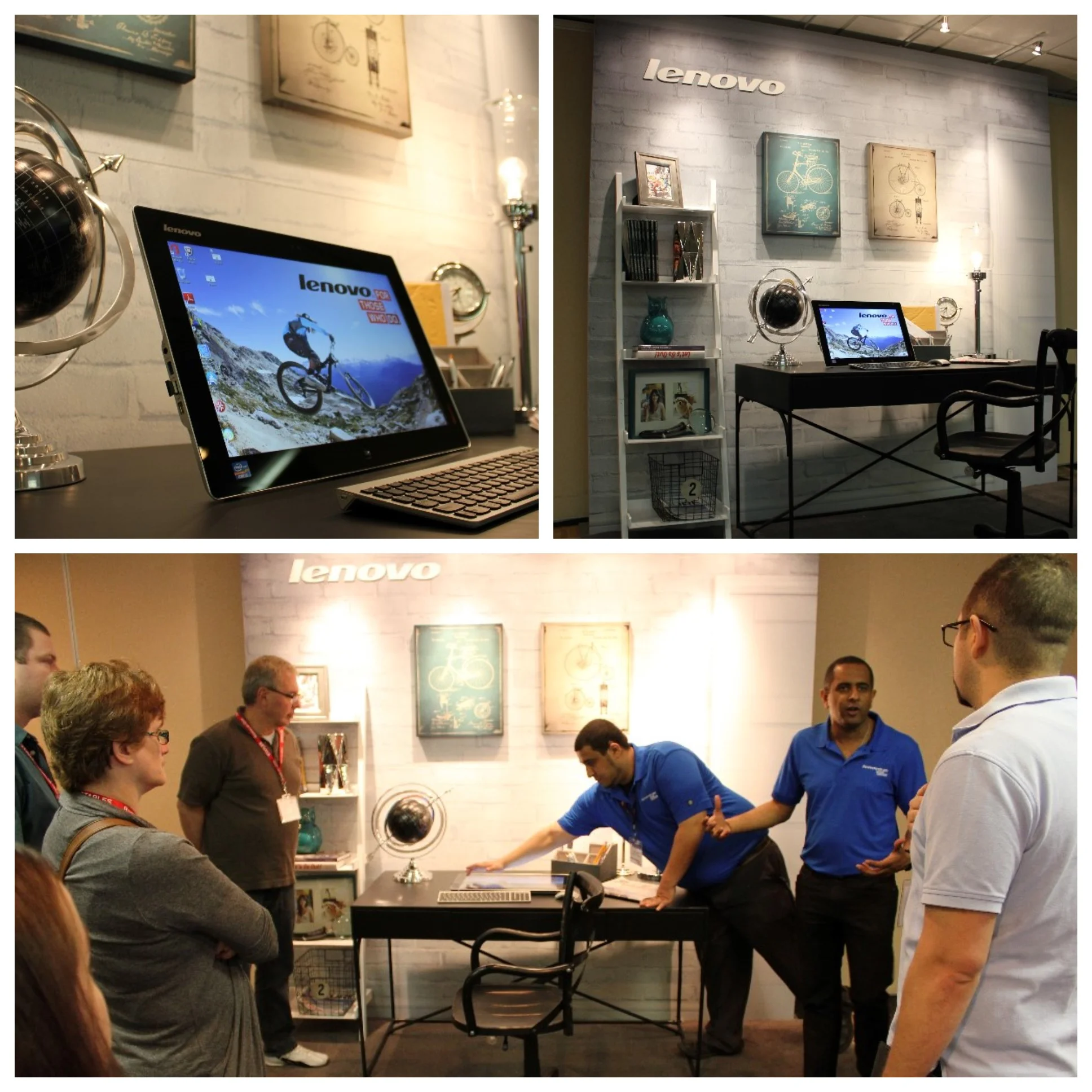
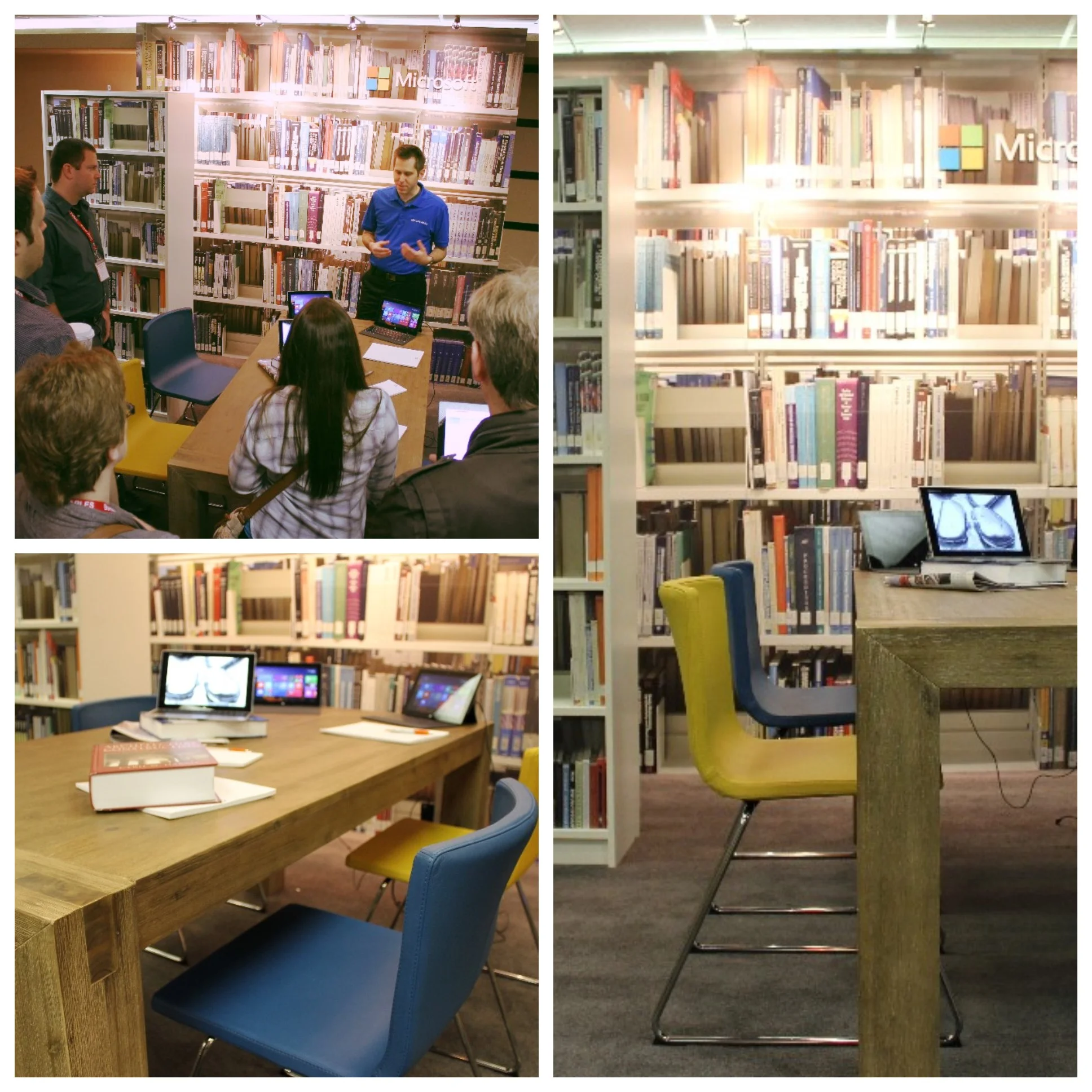
Microsoft and Lenovo Canada are showcasing their products at the Staples Back2School event today. It is all about the experience: Trainers showcased the devices in a library, living room, bedroom, cafe, office and lecture hall.
The exhibit spaces are based on 10' x 10' footprints. The interior design & staging for these themed environments was focused on showcasing their devices being used in the real world. The printed backgrounds are not photographs, they are 3D environments we created, rendered in Cinema 4D & VRay, and printed specifically for these displays.



With the weather we had in Toronto this past Winter, an iceberg sighting would not be impossible to imagine....but what about in Las Vegas?
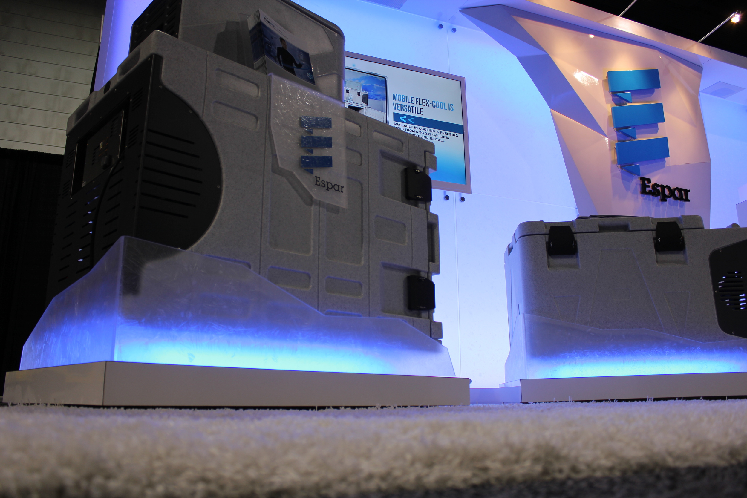
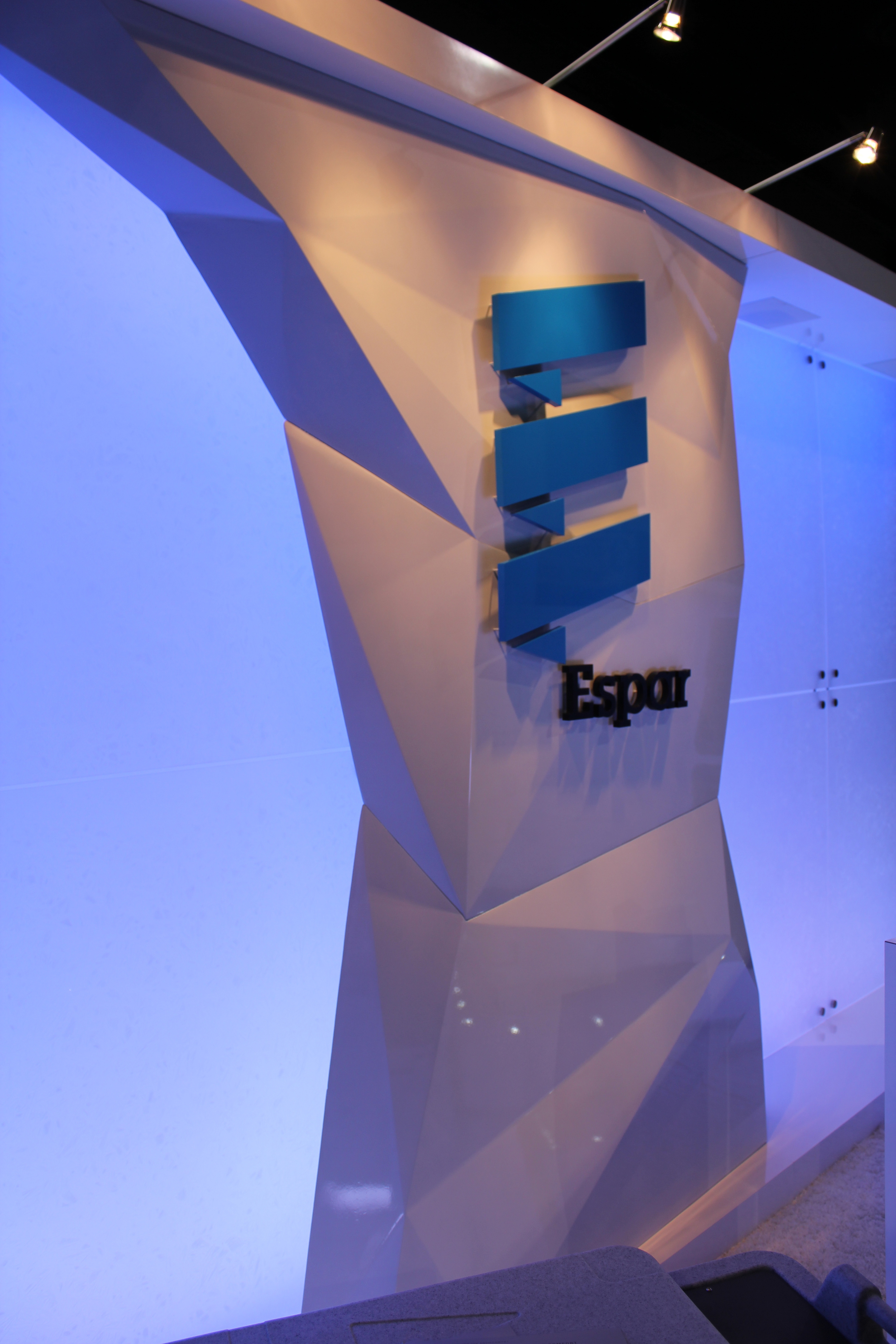
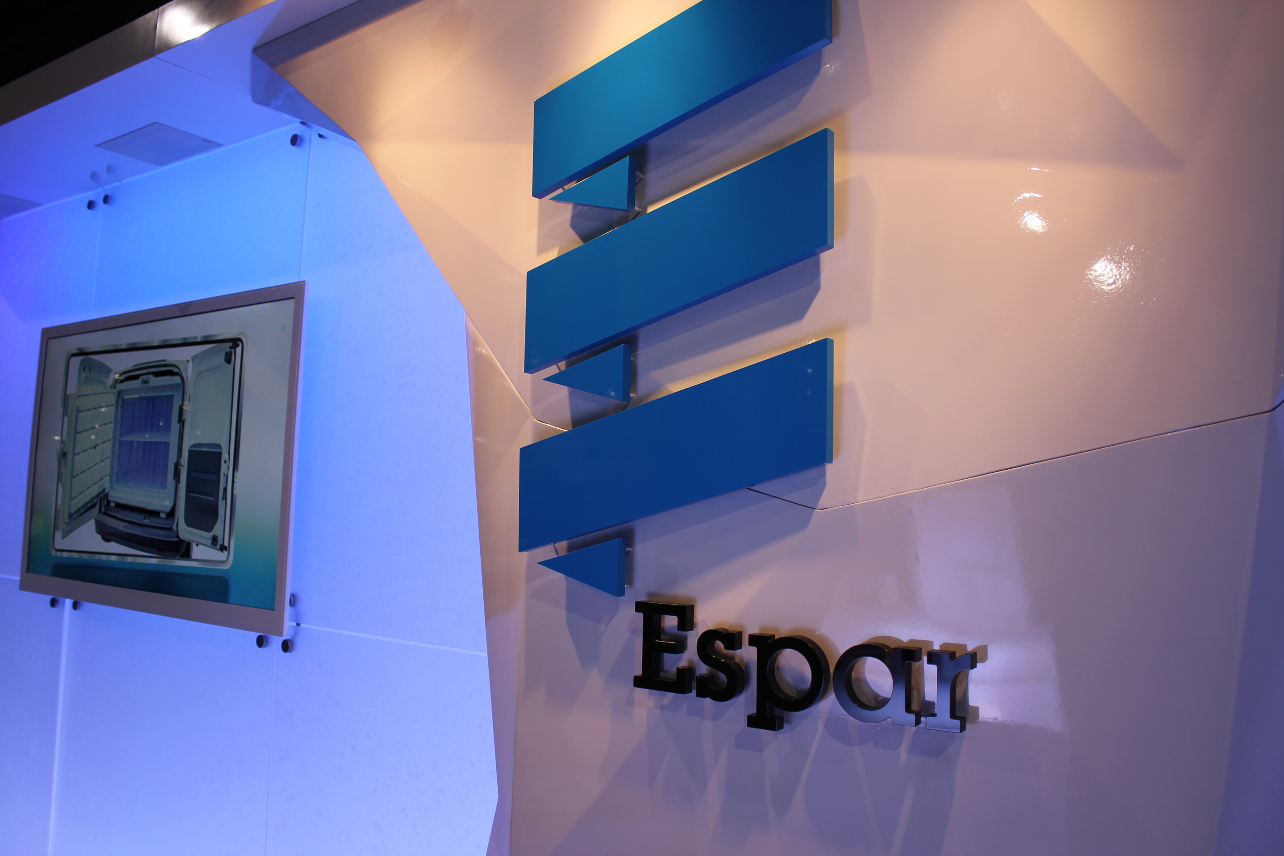
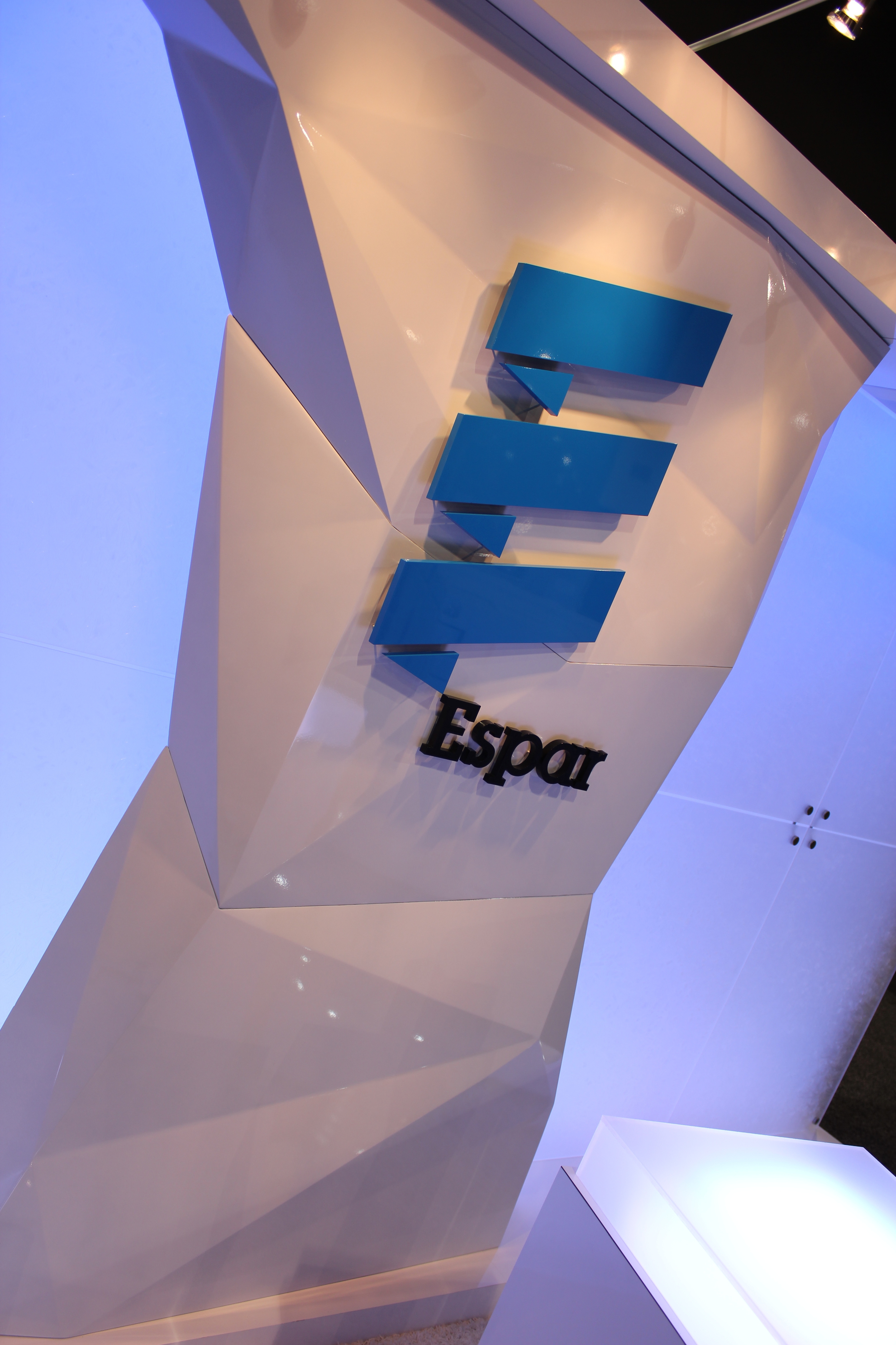
Eberspächer, known as Espar in North America, brought the Arctic experience to the 2014 Catersource show at the Las Vegas Convention Centre. Perhaps this cold weather, Polar Vortex and all, provided the inspiration for Espar's new booth promoting their Mobile Flex Cool units.
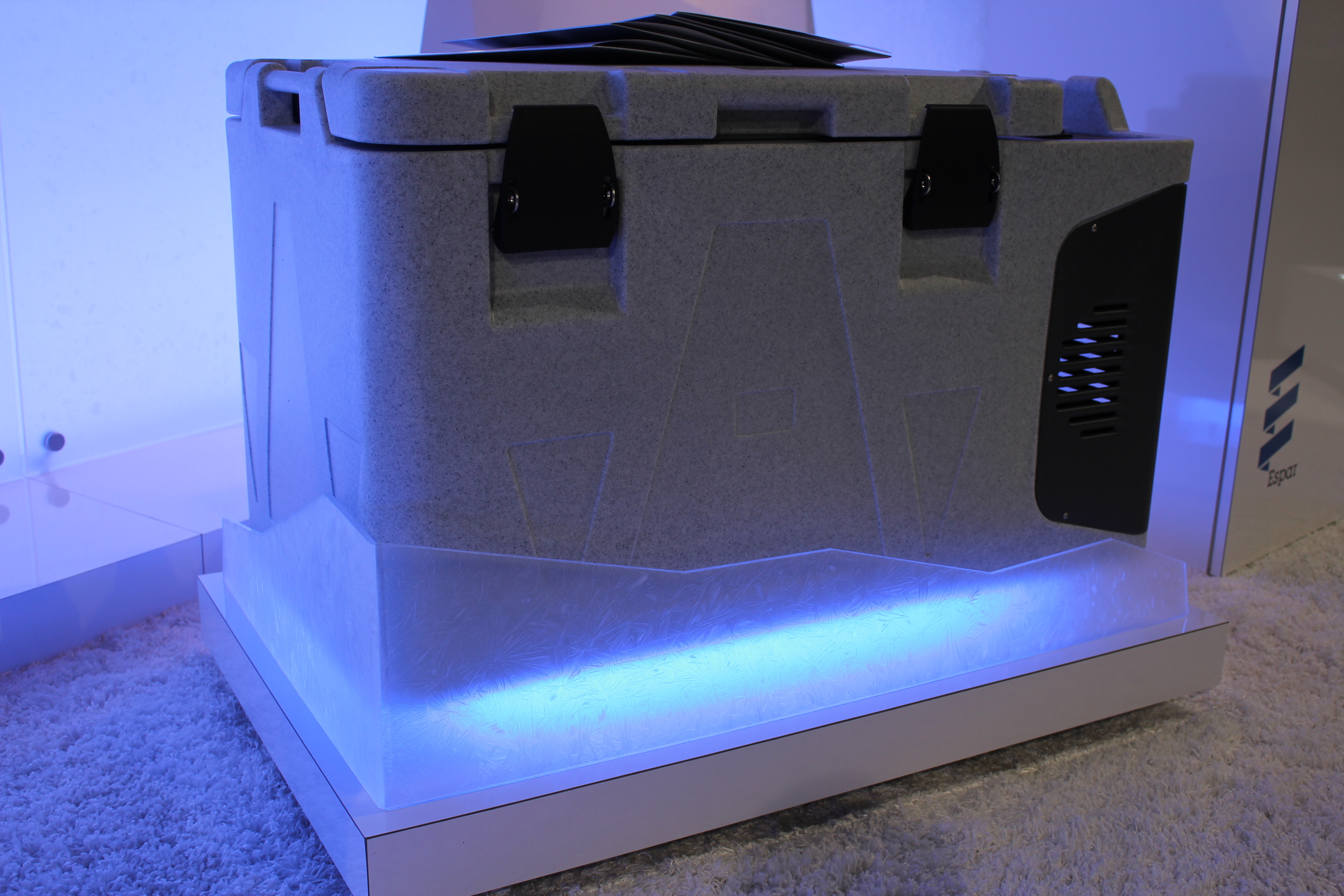
The units featured at the show are compressor cooling containers for refrigerating or freezing perishable goods transported in vans or cars.
Together with the Espar team, we crafted an exhibit that gave their clients and prospects an unforgettable Arctic experience at the show. Their new cooling units were the focus in the 10' x 20' booth space. All the other details aimed to take their visitors off the trade show floor and into an environment that helped the Sales team better communicate the capabilities and benefits of Espar's products.
From colour changing LED lighting along the entire backwall, pedestals and platforms
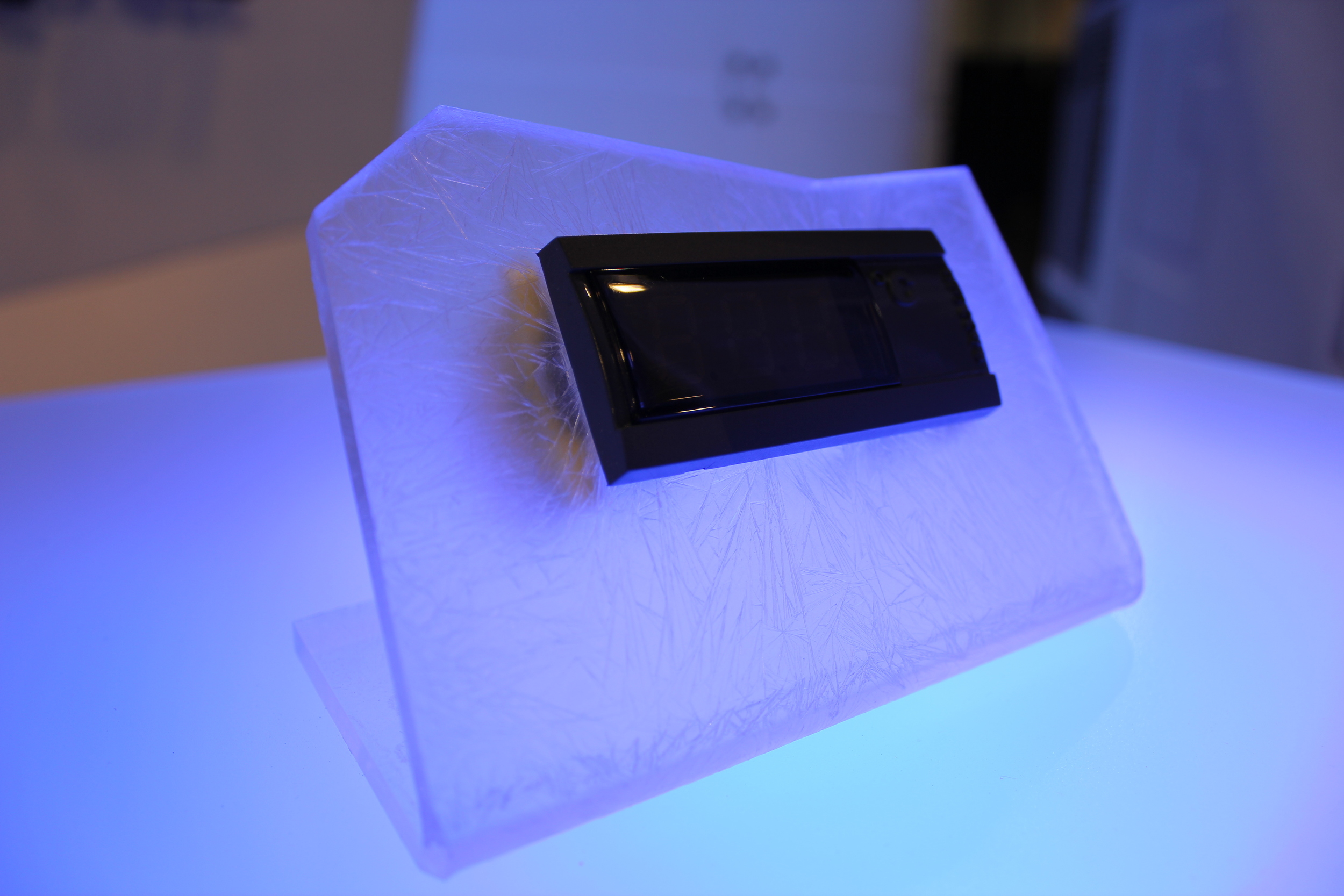
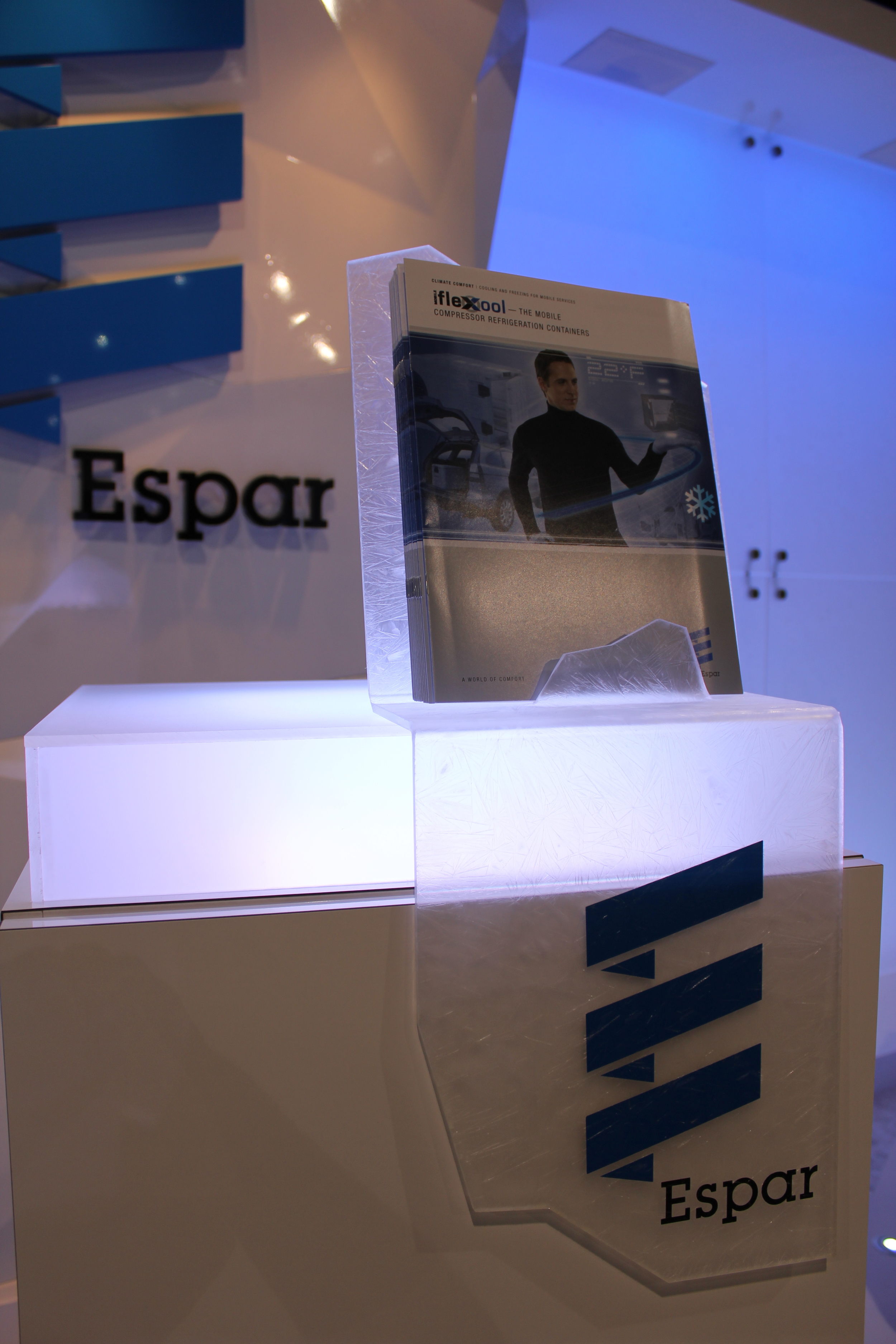
to the shards of 'ice' (actually acrylic sprayed with frost) everything was considered. These unique accents, were used to display brochures & control units, surround the platforms, and provided dimension to the backwall.
And not to forget: the iceberg in the middle of the booth.
Sculpted, coated in fibreglass and finished with an automotive paint - the iceberg although out of place in Las Vegas, was a feature component within the overall theme.

The response to this exhibit has been fantastic. We are very grateful to Espar for trusting us with another one of their new booths. It was fun developing and playing with their original concept to create this Arctic booth. So, the next time you are at a restaurant, catering, or foodservice show, don't be surprised to see an iceberg.
In collaboration with Starshot, a marketing agency focused on experience design, we crafted ten Microsoft Kiosks that were installed at the offices of different Toronto based advertising agencies. They were designed and built to showcase the XBox One, XBox 360, a Windows phone and Surface tablet.
As you can see, the initial concept was not far off from the final kiosk design. Our creative team worked closely with the production lead, as well as, the Account Manager to ensure that we built a display that supported the user experience the client had envisioned.
With a 10' x 20' booth space at this year's HRPA (Human Resource Professional Association) Conference & Tradeshow 2014, ADP Canada updated their exhibit with a custom back-wall, some new full height graphics, raised logos & letters (a personal favorite) and if you look closely you will see the 'walk-in closet' a.k.a. storage room on the right of the booth (a close second favorite in my books).
As I predicted - we were not disappointed at the Interior Design Show (#IDS14). The morning was spent along side design students, interior designers, and other industry professionals - all excited to see what the show had to offer this year.
Some of our favorites were the BigFoot Door booth, the Solo Home exhibit and the 'experience' at the Miele Booth. I was also blown away by some of the beautiful lighting, rugs and furniture some of the smaller and more independent designers brought to the show. I found myself stalking the Reed Hansuld booth because of the beautifully crafted chairs he showcased (yes....chairs).
Here is just a small collection of what inspired us today:
(images are also on our INSTAGRAM @exhibitcanada)
Registered & badge printed.

A group of us from the office are heading to the Interior Design Show tomorrow! We get a sneak peek on 'Trade Day' and from the photos I've seen on the IDS Instagram feed, we will not be disappointed. Although most of the work we do is focused primarily on a more corporate clientele, I'm sure I can speak for the rest of the team and say that it's refreshing to attend the IDS or IIDEX shows for some inspiration. Even when we are crafting a rental exhibit, each booth is custom designed and we add special features, textures, materials, lighting to make them unique. I'm looking forward to seeing what they have in store for us!
I was just able to get some photos from our newest build - we call it Microsoft Canada's 'Shadow Box' exhibit. These images are from a recent Future Shop event that took place in downtown Toronto. Our crew set up this custom designed exhibit in a day (I should have a video of the installation up by next week). The walls are about 10' high and 20' wide. The white panels are a high gloss laminate - while the back-walls were inspired by "shou-sugi-ban" a Japanese wood burning technique. With only 3 weeks to design and build this booth - everyone was excited to see it come together.
Clients ask us all the time about file formats, image sizes, and resolution for their booth graphics. If you are working with a graphic designer or an agency - in most cases they will know how to set-up the files for production. However, with some basic graphic knowledge under your belt - you should be better equiped to navigate this crazy world of artwork and printing
The EB Games Canada show takes place in a different location every year. This year it was held in beautiful Whistler, British Columbia. With a fantastic booth space (in the Grand Foyer of the Whistler Telus Conference Centre), the exhibit was spread out over almost 80 feet! We were able to take the whole foyer and turn the space into a complete Halo experience. We'd also like to thank Pascale at Gadbois Photography for the great photos she took at this event!
A couple of my favorite elements in this booth were the dimensional HALO 4 logos and the HUGE 80" TVs we used in the XBOX360 area.
I came across the link to the upcoming Greenbuild 2012 show in San Francisco and I found myself thinking about any changes, developments or advances when it comes to green exhibiting.
Yes, we are an exhibit house and I feel like it is our responsibility to be a leader in this space, but like everyone else we have to keep educating ourselves.
So...curious and excited, I did some research.
GREEN OPTIONS
To be honest I did not come across anything that was as amazing as I had hoped. However, I was still happy to find that there are more and more options for, and suppliers of:
Recycled Aluminum Extrusions
Bamboo products (flooring/infill panels)
water-based, low VOC (Volatile Organic Compound), and VOC Free stains and paints
Fabrics made from recycled materials
Graphics that are recycled, recyclable, or made from recycled pop bottles
Eco-glass (made from 100% recycled material) instead of acrylic
Eco-carpets
LED lighting instead of incandescents, fluorescents or halogens
Refurbishing existing exhibits
Recycling retired exhibit components
(to our blog readers - please feel free to share any green products for exhibits or trade shows that I have not yet had the pleasure of coming across)
You can check out other eco-friendly exhibit products from Exhibitor Online's 'Green Gallery'
SUSTAINABLE TRANSFORMATIONS
My feeling is that there are MORE products to choose from today - but I think it's how you manage your exhibit program as a whole that will have a bigger impact.
I don't mean to sound cynical but I think 'going green' is much more of a lifestyle choice - and not so much about a single eco-friendly bannerstand. That is why I think what Tom Bowman is promoting with his company Bowman Global Change is the way we need to take on our green initiatives, they "...help organizations make sustainable transformations."
MONEY MONEY MONEY
How can I talk about green initiatives and not bring up costs. I read a comment a U.S. exhibitor wrote about green exhibiting and he said that the only 'green' people see is the additional money they have to spend. The Exhibitor Magazine survey confirms this:
'In 2007, 73 percent of exhibitors reported they would pay at least a 5-percent premium for Green alternatives, compared to only 60 percent in 2011. Furthermore, the generally higher cost associated with Green materials topped respondents' list of primary obstacles in their path toward going Green, followed closely by the challenges of a weak economy'
[Source: Exhibitor Media Group - EXHIBITOR Magazine's 2011 Green Exhibiting Survey]
LOOK AT THE BIG PICTURE
With that said, I'd like to focus our attention again to the overall initiatives we could take to create a more sustainable exhibit program. A tweet just came through from the IDSA (Industrial Designer's Society America) sharing a seminar entitled 'Improving Products Through Sustainable Design'
"...Learn how to decide on the right strategies for optimizing a product’s life and end-of-life and how to get the most use out of the materials and energy that your product uses throughout its life cycle."
I guess that is how we should think of our exhibits or trade shows. Not as a one time purchase - but consider your exhibit in the context of your overall Marketing life cycle. I'm not saying that you shouldn't work with your exhibit house to choose the most socially responsible (and probably more expensive) materials and products for your booth - I'm just suggesting that you also consider the impact of shipping, number of staffers attending, printed materials for your show, and tackle these along with designing and building a sustainable exhibit.
_________________________________________________________________________
I'll leave you with this excerpt from Invista's 'non-booth concept' press release for Greenbuild in 2008:
In lieu of shipping a booth and supplies to the show site in Boston, INVISTA created its exhibit with all locally sourced and reclaimed materials, based on a minimalist design. Defining the space was a 14-year-old carpet removed recently from a leading Boston-area university, which demonstrated durable performance and the environmental message of the Antron® carpet fiber brand, “Sustainability starts with products that last.”
Vintage furniture greeted visitors along with 1950’s style chalkboards that displayed brand messaging and graphics created onsite by an artist, all sourced locally. All booth materials were reused or donated to local charities after the show. The reclaimed carpet were cut into sample sizes and used by Antron® fiber consultants to demonstrate the lasting texture retention, soil resistance and stain resistance Antron® fiber brings to commercial carpet constructions
[Source and full article: Invista / Officenewswire]
Our 'Exhibit Rendering or Exhibit Photo' post was quite popular so I thought I would share some more images with everyone. To be honest, even though I look at these everyday, I am still surprised at what technology allows us to do when designing an exhibit or booth concept. The graphics may not be the same as the ones chosen for the booth - but exhibit renderings provide us with a great opportunity to see what the final concept will look like on the show floor.
The design and rendering process takes a long time but the outcomes are pretty impressive. Below are some more rendering versus photo examples of both purchased and rental installations/booths:
Tire Wall for Hyundai Dealership
at the Wal-Mart Vendor Fair (Rental)
at the Wal-Mart Vendor Fair (Rental)
at the Home Hardware Event (Rental)
10'x20' - 10'x10' (Purchase)
We receive a lot of calls from exhibitors who want to make the jump from their draped table to a custom designed booth. Some already have bannerstands and pop-ups but are looking to make more of an impact and stand out from their competitors. Here are 5 tips on how to move from a portable to a custom exhibit.
I often visit the Houzz site and love looking at beautiful homes, but I often wonder how those owners keep their amazing spaces neat, tidy and free from clutter. Of course most of these houses had interior designers hard at work and it got me thinking about an article I just saw posted by Freshome Design & Architecture; it was about home staging and the impact on the sale of your property.
With Toronto's housing market booming the way it is - I have experienced first hand what a difference it makes to stage your house for sale. I'm not only suggesting for you to clean your home but have a design savvy friend help you de-clutter your space, rearrange furniture, or even go out and hire a professional stager. Home buyers will not be able to look past all the 'junk' at the beautiful woodwork, the great pot-lights, or the beautiful kitchen.
I believe the same applies to exhibits. I started to think about what booths we have done where staging played an important role in making the product or messaging stand out.
I want to share two examples. The first is Microsoft's 'Home' exhibit for a Future shop event in Whistler. They had asked us to help create an environment, that not only provided some space for a trainer to talk to a few attendees, but also allowed them to showcase their products in a 'home' setting. This booth was very different from our usual 'corporate' exhibits and even though we did not go the traditional route of building a small scale house - there was still a lot of staging going on!
The second example I found (and we can't take any credit for the staging!!!) is from Mucci Farms.
The first set of images were taken after our installation crews set-up the booth: you have the carpet down, the exhibit structure up, the lighting, graphics, AV and rental furniture ready for the show.
You can see from the 'before' and 'after' that the booth is fairly plain until all their produce is showcased throughout the space. The greenhouse vegetables are so vibrant in colour and the Marketing Coordinator did a fantastic job incorporating their product into the staging of their exhibit. Cushions, vases, bowls, and other accessories were used to complete the look.
I guess staging is not strictly for your home anymore!
If you want some tips on styling or staging your home (or even exhibit) - you can read the article
"Why Home Staging Could Give You The Edge in The Property Market"
I have this conversation a lot with clients: Why should they rent their exhibit?
Because it makes sense. Not for every exhibitor and not at every event - but in many instances I see our clients benefit from renting instead of buying their exhibit.
We created this advertising piece below (it was a double sided card - so the text below is the back). It summarizes the key reasons for choosing a rental booth.
In essence - it's about flexibility and making your show budget go further. At least that is how I like to look at it.
Gone are the days when Marketing Managers had 'unlimited' trade show budgets like in this custom exhibit with intricate mill work at the 1893 Chicago World Fair.
1893 Chicago World Fair - Michigan Exhibit (Source:PeriodPaper)
Today we are still focusing on cutting costs, economical solutions, minimizing expenses, and maximizing your show R.O.I.s (while still trying to impress your attendees with an amazing booth!)
We have seen many clients go from a 600 to a 200 square foot space, and vice-versa. This may be a result of changing Marketing budgets and because they invest in different sized spaces at different shows. Add another dimension, that these shows don't happen every year, and now what do you do with a booth purchase that only fits the space for one of your four events?
Almost all our clients change their exhibit from one event to the next. Even if it's just adding seating or a meeting room, changing the layout, enlarging the storage room, or changing the size - you can always make improvements to your booth and I like that a rental exhibit gives you this type of flexibility.
Unless you know that you will be using the same booth, in the exact same configuration for at least 4-5 shows, consider a rental exhibit. If there are some core elements that can be used at every event and in every size configuration look at a hybrid solution (a combination of custom purchased components + rental components).
Hybrid solutions give you a little more customisation and unique elements within your rental exhibit.
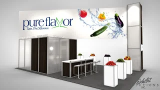
A lot of our exhibits are a mix of custom elements (purchased) and rental components, like this 20'x20' exhibit we designed for Pure Hothouse. The glowing pedestals, dimensional lit letters, and graphics were custom/purchased components and most of the structure is rented. That is why you can also see a 10'x20' concept in which a combination of custom components and rental structure is used. For the 10'x20' they only rent the exhibit structure they need instead of carrying the cost of the full 20'x20' version.
I am sure we will come back to this rental discussion over the lifetime of this blog and even though I can appreciate that a rental exhibit is not the right fit for every company I think renting a custom designed display will continue to be a popular choice.
I was contemplating what I could share with you this week and even though we are currently gearing up for some major trade shows in the next month I kept thinking about this very cool product:
"RADIAN - a motion time lapse device for everyone" Kris Cheng - co-founder
(I'll post another update with photos on the exhibits we are building for Kruger and Flakeboard in the next couple of weeks so stay tuned).
Back to Radian. I know it's not directly trade show related but I'm sure a lot of you photography enthusiasts, IPhone lovers, Engadget readers, builders, stagers, designers, artists, and of course exhibitors....will appreciate this gadget. (watch it here !)
Radian: a motion time-lapse device for everyone from Kris Cheng on Vimeo.
A time lapse video is a very unique way to showcase changes over time. As you can see in our recent exhibit build for Microsoft on YouTube, it's a great way for an exhibitor to see their booth come to life. I used to believe that things like this were only for photography professionals but Radian is compact, has a very clean design, can move from side to side, tilts up and down, is programmed with your Smartphone app and on top of all that - it is extremely affordable even to the casual user.
It's not yet in production (we came across it through a great program/site called Kickstarter "a funding platform for creative projects.") I'm not using this post to get you to pledge, I just wanted to share a very cool product because we love to support innovation and the entrepreneurs who create, design, and bring them to us.
I believe the reason we relate to things like this is because we are a small boutique exhibit house. We like to push our boundaries, we like to try new products, and we like to design & build exhibits with the same enthusiasm that these entrepreneurs do.
Here are some more images:
(Source - Kickstarter)
Booth flooring is an important component in the exhibit design process.
Work with your exhibit house to make your space stand out - review design options, look at samples, consider 'green' solutions, think about longevity, and imagine it in the context of your booth.
Flooring can definitely set the tone for your entire exhibit. Take a look at Outotec's booth as an example. One design uses a white carpet - the other shows a grey option.
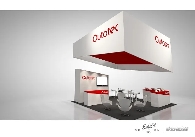
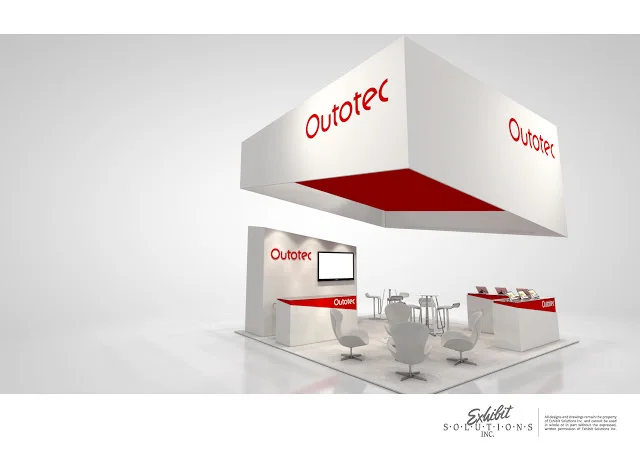
They have very different 'feels' depending on the colour choice for the flooring.
Which one do you like? I immediately fell in love with the white carpet but started worrying about visitors spilling drinks, dirty shoes leaving their marks, and all the other practical concerns I have!
Once again it's a form versus function debate: Yes, dark flooring is practical. Yes, it will be stain resistant. Yes, it will last longer. BUT - Our designer has won me over....I love the white flooring in this booth.
(For those of you who are not convinced - keep a carpet cleaner handy during the show, have your carpet washed after a couple of events, and set some funds aside to splurge on a fabulous new white carpet when the old one starts to show some wear and tear!)
Here are some tips on why carpet (don't worry - it does not have to be white) is still a popular choice:
Carpet is still the most popular choice
It comes in a wide range of colours
You can choose eco-friendly products
It is easily installed & dismantled for an event
It provides comfort (with underpad) if you are standing for hours
You can easily hide cables
Carpet is customizable (printing or inlays)
It is one of the most cost-effective solutions (purchase or rental)
Here is a short video on some of the other flooring products
we use for trade shows (I always thought the artificial grass was neat and am pleasantly surprised about how good roll-able vinyl flooring options have become).
In the video you will see samples of carpet, vinyl flooring, synthetic grass, LED light tiles, printed tiles, printed carpet & underpad.
This is Mucci Farm's exhibit where we used a 'wood' vinyl flooring along with a charcoal grey carpet.
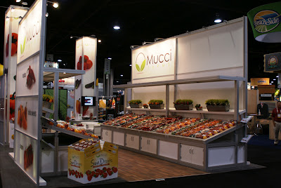
Even though we are not always able to use residential or commercial flooring products at events - there are many great flooring solutions available that are made specifically for the 'temporary nature' of trade shows (interlocking tiles, 'easy' raised flooring, printed carpets, textured vinyls, etc.).
As I mentioned above, choosing the right flooring is an important part in the exhibit design process and in setting the tone for your booth. Look at samples, trust your designer, and take advantage of all the new flooring products available.
*If there are any cool flooring products you would like to share - please feel free to comment!*