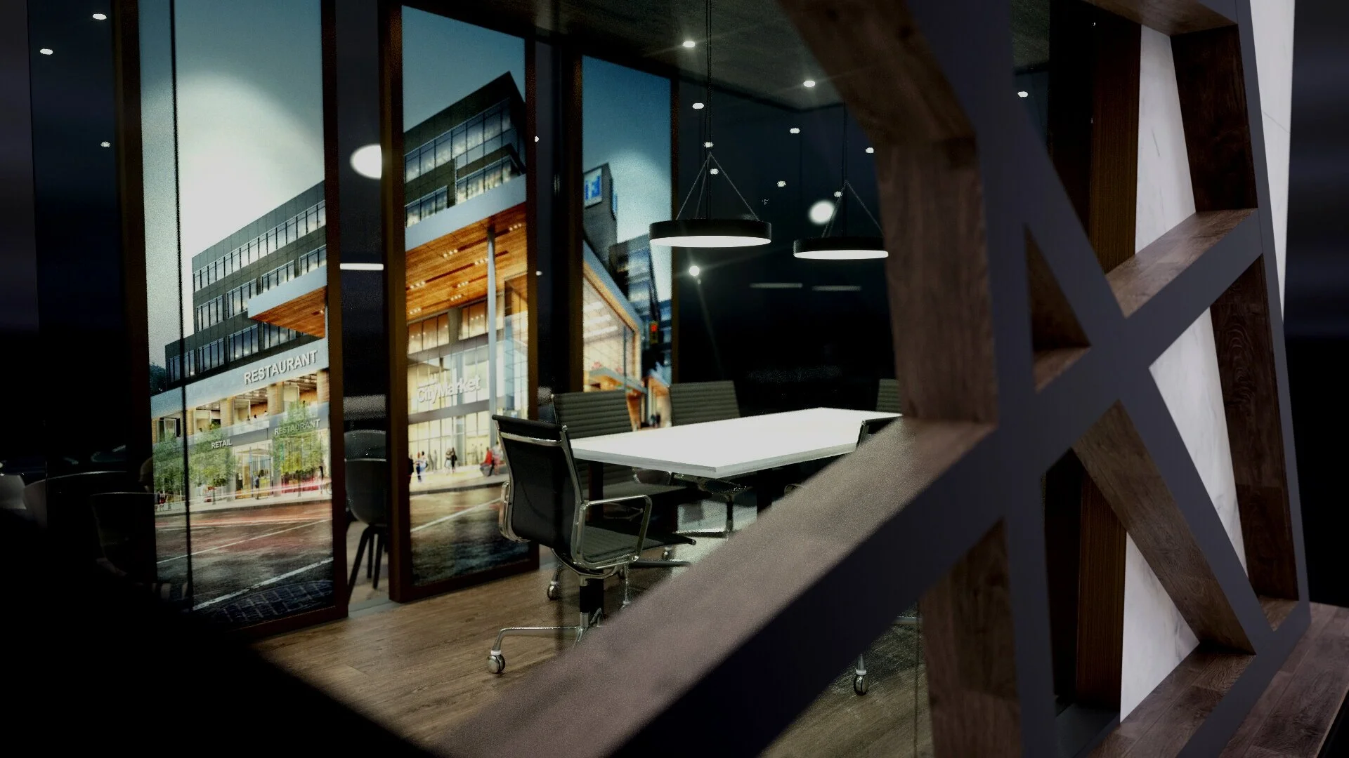
Exhibit Rendering or Exhibit Photo?

I was looking at an image today and could not tell if it was an artist's rendering OR if it was a photograph.  Today's post is not very serious, nor does it make us experts in the latest design technology - but I believe it does create a little bit more awareness and appreciation. 

As recently as 10 years ago our exhibit designers only sketched and drew booths using pen and paper (As an exhibitor, or even someone hiring an architect to remodel your home, you will probably come across a rendering or two.  Because we are so used to seeing pretty pictures and photographs instantly we often forget the amount of time and effort it takes to create these digital masterpieces.  These drawings bring the booth ideas to life and help us imagine them on the trade show floor.  In the last few years I have truly gained an appreciation for the artistry and technical skills required to develop exhibit renderings or 3D animations.  Hours of work on the designers part leave you with images that are so realistic - the lines between the booth photo and the renderings start to blur.  Here is an example of

Intelerad's

2011  exhibit for

RSNA's

2011 annual radiology meeting.  Can you tell which one is the photo?

You can also see Intelerad's 2010 exhibit renderings and photos on our site here

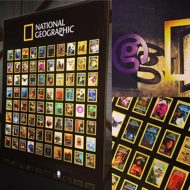
Here are some other cool examples I found: 

Ronen Bekermans - render vs photo review

Setting up Microsoft's 'Shadow Box' booth

I am excited to share the installation video of Microsoft's 'Shadow Box' exhibit!  

This video was filmed using time lapse and took almost 1600 photos in a span of ~ 8 hours.

Two 10'x20' custom designed walls made up this 20'x20' booth. 

Although the columns in the venue made it difficult to find a good spot for the camera - we were able to capture the set-up of one of the walls. 

It took a crew a full day to install the carpet, exhibit structure, signage, lighting, AV and one day later it was all dismantled again.  If you every wondered what it takes to set up an exhibit here is an example:

Microsoft 'Shadow Box' exhibit Installation

Are we there yet?

Are we there yet?  The short of it is - not quite.  The long story is - that creating a new blog page was easy.  Making sure everything is perfectly aligned, has the right widgets, the right imagery, the right settings is not.  Getting caught up in the technical aspect is not really where I wanted to end up.  

The Exhibit Solutions blog has been created so that we have a place to share experiences, educate, showcase designs, share 'things' (art/design/technology/innovations) - essentially anything exhibit, event or trade show related that we get excited about.  As a boutique exhibit house we are small enough to engage the whole team and our clients in discussions over advancements in booth lighting, new fabric graphics, green flooring, and the list goes on.  The fun part is that we are big enough to actually try these things out in our booths.  So - with that said, I look forward to sharing our story with you and in time I will master the page alignment and blog widgets too.